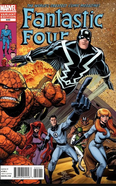
One of the few comic book pleasure open to this old comic book fan is when I see new comic book covers that are based upon a previous classic cover from the silver and bronze age. These are commonly referred to as either homage or tribute covers and sometimes rather cruelly as swipe covers. Personally, I like to see these when they are done properly as it’s nice to see a modern artists take on a classic cover although sadly the practice is becoming over used and is starting to feel more like a marketing ploy rather that an artists appreciation of a past cover. Some of my favourites in this genre like the above homage cover by Art Adams of Jack Kirby’s Fantastic Four issue 82 is a stunning version of a genuinely classic original cover.
The original Jack Kirby cover (above).
One of the most commonly used tribute covers has to be Flash issue 123 “Flash of two worlds” by Carmine Infantino and Murphy Anderson. This version by Nuno Pereira for “Archie, the married life - 10 years later” is a clever and humorous take on the classic.
The cover to Flash issue 123.
I’m not sure if its vanity when an artist pays tribute to his or her own work or if they have been specifically asked to do this. But here we see the great Neal Adams pay tribute to his own iconic Batman issue 251 cover for the first issue of the Joker.
The original cover to Batman issue 251.
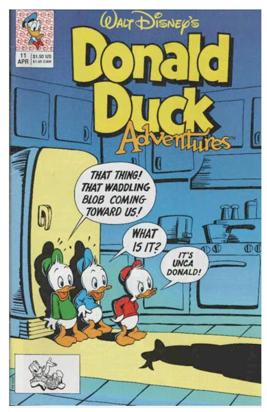
One of my favourite homage covers is Donald Duck Adventures issue 11 which does an excellent job in representing the classic first issue of Mad to a new audience (and one old guy!)
Mad issue 1 by the great Harvey Kurtzman (cover taken from the Grand Comics Database).
Homage covers are by no means a new phenomena in comic book publishing as artists have been doing this since the 1940’s (and probably even before that). One of the earliest tribute covers I can remember was the cover to Superman 147 (1961) by Curt Swan and Stan Kaye who paid homage to their own earlier Adventure Comics issue 247 (1958) cover.
The original and classic cover to Adventure Comics issue 247 (covers taken from the Grand Comics Database).
Finally, leave it to Archie comics to come up with truly clever versions of the classics. This cover for a one off issue of Archie complete with faux cover marks and creases , ripped edges and paper browning by Andrew Pepoy is based on the classic 1950’s art of Wally Wood (I think this may be specifically a tribute to issue 27 of Weird Science Fantasy).
Weird Science Fantasy issue 27 - (cover taken from the Grand Comics Database).


Again, some great covers there, McS. As you know, I've shown a number of 'Comic Covers Snap!' over on Crivens! and I always find them fascinating. What I can't help wondering though, is whether a modern readership is even aware of the originals and gets the fact that the new ones are 'tributes' to past covers? If not, then it's not a very effective marketing ploy, with the exception of for old farts like us.
ReplyDeleteI’m the same Kid I find these homage covers fun and amazingly I can spot the good ones (from the silver/bronze age) easily in amongst the plethora of titles on the shelves (it’s my superpower). Sadly the interior story and art and for me are never as inspiring as the tribute covers. I think older folk form quite a large core of the comic buying clientele and although they may (hopefully) not be the main customer base the tribute covers are generally not the main cover but are a limited edition aimed at specific groups along with the a couple of other covers, I assume to maximise sales. And for every silver/bronze age homage cover there are probably about 6 1990's – 2010 cover tributes on sale. I agree though I doubt many (if any) 18 year old comic readers are aware that some of these tribute covers are from classic old comics but wouldn’t it be nice if they just liked them and thought they were exciting and fun and picked up the reprint collections?
ReplyDeleteYeah, on your last point, that would be good, McS. Let's hope it's happening and continues to grow.
DeleteI'm a big fan of these kind of homage or swipe covers. Once upon a time they were relatively rare and often more subtle. Nowadays it's clearly intended as a direct swipe of a specific cover. There's no attempt to bamboozle anyone so I say the more the merrier. Modern covers tend to be pretty bland, so swiping is a good way to get some more complex layout designs also.
ReplyDeleteRip Off
That's largely my thinking Rip, I find modern covers are just poster \ pin ups with no attempt to tell the potential purchaser what the story is about.
ReplyDeleteHi, McScotty. The Archie cover is definitely my favourite of the ones above.
ReplyDeleteHi Steve, Archie have done quite a few of these types of tribute covers and all the ones I have seen have been really well executed and funny. They did a really good tribute to Marvels “What if ?”comic issue 10 (“ what if Jane Foster had found the hammer of Thor” but with Betty)
ReplyDeleteTo answer Kid's question - back in 1980 I bought Uncanny X-Men #135 which had a cover showing Dark Phoenix reaching up and crushing the X-Men masthead. I loved the cover but I didn't know at the time that it was a homage to an earlier X-Men cover from the late '60s. I recognise a lot of homage covers nowadays but I didn't when I was 14.
ReplyDeleteFew of us recognised them at that age, CJ. Knowledge requires time.
DeleteI know both issues well Colin. I used to have to original X-Men comic (issue 56) with that cover by Neal Adams. I forgot issue 135 was a homage and a very good one by John Byrne.
ReplyDeleteA great selection of covers, McScotty. I especially like the Archie versions..they seem to both evoke the spirit of the original comic while coming up with something new and innovative in its own way. That said, I cannot see the point of reworking the Fantastic Four cover at all. Even the reworking of Batman #251 to Joker #1 by Adams himself seems more a commercial stunt than anything else. Adams did similar reworkings of most of his famous covers a couple of years back across the entire DC line (which I dutifully bought), but I've had no inclination to go back and take a look at the repurposed covers. The originals were of their time ; the new versions seem a cynical attempt to cash in on boomer nostalgia.
ReplyDeleteLike yourself I've never fully understood why Neal Adams recreated covers he already drew as newer versions, maybe from a different viewpoint would have made more sense. Almost seems self serving or as you say was just for commercials reasons for fans like us to pick them up (and yes I did lol). I really like the Art Adams cover but as you say it's just a bit too much like the original.
ReplyDelete